Upgrading to Windows 11
While F12’s solutions design team is busy testing and hardening Windows 11 for the business world, many are starting to get their first look on consumer devices. So, our CMO, Devon Gillard, asked his father-in-law, Murdoch Macleod, a retired journalist, to share his experience. And he didn’t hold back!
Murdoch Macleod Shares his Experience
There is much to like and a bit to get used to, and only two things went haywire in my upgrade to Windows 11 from 10.
It was a fast process, too: only an hour and 13 minutes from selecting the download until the computer offered to schedule the restart. Adding in looking around the new system, only two hours and 26 minutes elapsed for a major upgrade.
After installation came the real test: what will survive the installation of a new operating system? I had prepared for the worst by copying my files to a USB memory stick.
The computer booted to my familiar splash screen, a family photo that’s amusing to us, anyway. But the time was shown in the centre of the screen instead of displaced to the left. What could be happening?
My favourite Linux distribution uses a left-side menu. Windows 10 uses a lower-left Start menu. That is practically “where the start menu belongs” no matter which OS you prefer. I believe most computer users consider this a feature, not a bug.
The Start menu was not in the lower left. 
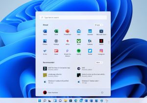
There was a set of half-a-dozen icons centered on the taskbar at the bottom of the screen. A Windows icon, a magnifying glass, what looks like an emailer with a reading pane, Edge, File Explorer, and a video camera. The video camera was “Chat” but it turned out to be Microsoft Teams.
If you use Teams, the taskbar’s a good place for it. I’m retired and don’t need Teams. I found it quick to unpin after a right-click on the icon.
I like to have only a few and utterly essential applications pinned to a favourites list. Having them easy to find in an uncluttered place is the idea. I substituted the Mail app for Teams in the taskbar. I use Hotmail for my main email address and the groups I volunteer with email volunteers a lot.
I thought the magnifier was a Search icon and it does offer search. But it lists icons for recent and often-used apps.
The emailer with the reading pane is a Widgets menu with the weather, sports results, and news feeds.
The Windows icon opens the Start menu. The menu is in the middle of the screen and squarish but blood is not dripping from the trees and the apocalypse has not started. So the world is OK even though Microsoft moved the Start menu.
I actually like this Start menu.
It has a six-by-three grid of icons that are more cartoony than recent icon sets. I am almost reminded of Windows XP.
I find it a lot easier to pin and unpin apps to the new start area or to the taskbar. It seems to be easier and faster to customize the Windows experience for different users. For my money, that’s all to the good.
Unless you’re really in love with Windows 98 or Mac System 7 of 1993, you can forgive the taskbar.
The windows look a little bit Mac-like but still have the understated close, resize and minimize buttons. MS Mail sported a new look before Windows 11, so it’s not unfamiliar.
Oh yeah: the two things that went haywire:
My pin-to-start choices and my browser homepage did not survive. I had to fix the icon selections and reset the browser homepage.
My files came through OK and I did not need the USB memory stick, except that backing up files is always good. I checked for file survival before I explored the rest of the taskbar and the file menu.
Altogether, this upgrade is actually an upgrade.
Get in touch with us today to learn about how F12’s Infinite program can keep you up to date and ahead of the competition.


